Pages

Tuesday, November 24, 2015

Google fonts; A very useful tool when designing websites

When using fonts, you try to pick fonts fitting to whatever design you are making. Normally, though, you don't have that many preinstalled fonts in whatever program you may use, and installing fonts is a huge pain, so instead you use css to add options for fonts, while you can't use too many since the more you have, the more the browser has to load. This is known as Google Fonts, a program created by google to greatly expand the number and types of fonts available to web designers when creating a site. As you can see below, a site I created called Jabberwocky with the font Times New Roman, Verdana, and Arial.

Next, we have the same site, just using a font called Vollkorn.


See how much better it looks just from changing the font? Next, the font used is called Libre Baskerville.


In conclusion, fonts do so much to a website, and they can either make or break a website, a website can be much worse if it was all inTimes New Roman, or even Comic Sans. So make sure you use this incredibly useful tool when in need of new, creative fonts!

Sunday, August 16, 2015

Best Stock Images


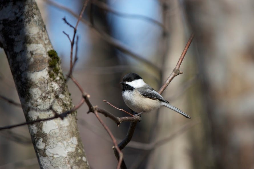
  The theme I chose for my stock images was, well, birds. Simple enough, I suppose. I love birds, and apparently tons of photographers do too. It'd be kinda weird just to sell un-retouched photographs of birds.

-On which site did you find the best photo?
  The best quality photo was found on morguefile, because of the many options I had.

-On which site did you find the most photos?
  Like I said in my last answer, morguefile had the most selections out of any site.

-Which site was easiest to to search and navigate?
  I would say pexels, the search bar didn't take any effort to find the search bar, and it wasn't a chore just selecting an image, unlike some other sites.

-Which site was easiest for downloading a photo?
  Any of them, I just right-click and select "Save image as..."

-Morguefile:
pro- Easy to navigate, and gives many results.
con- Half of those results are poor quality.

-Pexels:
pro- Search bar is east to find.
con- Doesn't give very many results.

-Gratisography:
pro- Fun, stylish homepage design.
con- Hard to navigate.

-Unsplash:
pro- Great, interactive site layout, especially for selecting photos.
con- Doesn't give many results.

-Which site will be your "go-to" first choice the next time you need a photo? Why?
  My fist chouce is definitely morguefiles, the site's easy to navigate, it gives plenty of results, and it gives off nice quality photos.

-My best photos


Pexels


Gratisography


Morguefiles


Unsplash


Wednesday, May 6, 2015

Vitamilk

This is my product, Vitamilk. Vitamilk is a special milk that repairs your broken body, and it's filled with great nutrients. Making the label had it's troubles, but the real challenge was getting the 3d revolve to work correctly. After countless events of trial and error, I finally got my label, and die-line to fit correctly on my bottle, and box respectively.


As you can see, this is my creative process, first thing's first I had to find my color scheme, Mine is made of basically the color scheme of a cow. I also created my logo, hand drawn. For what font I used, I first wrote out what my logo should look like, then i went in to find a font that resembles it the most.


In the end, I am greatly satisfied with how Vitamilk turned out.

Monday, April 20, 2015

emagine experience

eMAGINE

emagine was so much fun! I got to hang out with my friends, get to look at these amazing entries that were all made by just students! And not to mention, we got free food after the awards. All in all, this was a great celebration of students who have these fascinating talents, and I'm happy I was there to see it!!

Friday, March 27, 2015

Desktop and mobile statistics


      Over the years, the percentage of desktop sessions on our very own onwravens website has gone down 24% since the year 2013, all the while he percentage of mobile sessions has gone up about 20%, so as you can see, mobile browsers are being used more heavily, and is beginning to overthrow desktop. 

Bounce rate    


Bounce rate is the rate at which people enter a site, and leave without visiting other pages on the site, this is most used to determine a websites effectiveness, and appeal of a website. on the onwravens site the bounce rate has gone up only about 1% over the past 2 years, it can be estimated that the bounce rate is rising along with the percentage of mobile sessions.

  Above this text is a chart made in 2010 to try to predict what mobile and desktop user statistics in 2015, and while it's not exactly correct, it is vaguely right in its predictions.

Friday, March 6, 2015

Movie Poster

SUPER SMASH BROS. MELEE

 MOVIE POSTER

Process

 This poster took editing shapes, using transform to edit text, and some more. I started with an idea to incorporate the most recognized stage, and a symbol of the game itself, Battlefield. I started this by recreating the very simple and basic form of the stage by combining rectangles, and triangles, I only used 2 colors; black, and a deep scarlet, I then  wanted to re-create the main logo of the game, but with a more simplistic typeface. 

Goals

  I mostly stuck to what my original idea was in mind, but i was going to put a smaller smash symbol with just an M, and i was going to put it in the center of battlefield, and the text would have been on the top. I am glad with how it turned out, in fact, I like this design much more than the on I had planned.

Time Management

I could have gone a bit faster on this project, but I'm happy that i took my time on it, because my thought sat and fermented for a bit, so my judgement was better in terms of design, I asked for my peers' advice and what they thought, that helped a lot in the thought process, I also had to think in the mind of a consumer, or a third party so my own intentions don't get in the way of the appeal.