The theme I chose for my stock images was, well, birds. Simple enough, I suppose. I love birds, and apparently tons of photographers do too. It'd be kinda weird just to sell un-retouched photographs of birds.
-On which site did you find the best photo?
The best quality photo was found on morguefile, because of the many options I had.
-On which site did you find the most photos?
Like I said in my last answer, morguefile had the most selections out of any site.
-Which site was easiest to to search and navigate?
I would say pexels, the search bar didn't take any effort to find the search bar, and it wasn't a chore just selecting an image, unlike some other sites.
-Which site was easiest for downloading a photo?
Any of them, I just right-click and select "Save image as..."
-Morguefile:
pro- Easy to navigate, and gives many results.
con- Half of those results are poor quality.
-Pexels:
pro- Search bar is east to find.
con- Doesn't give very many results.
-Gratisography:
pro- Fun, stylish homepage design.
con- Hard to navigate.
-Unsplash:
pro- Great, interactive site layout, especially for selecting photos.
con- Doesn't give many results.
-Which site will be your "go-to" first choice the next time you need a photo? Why?
My fist chouce is definitely morguefiles, the site's easy to navigate, it gives plenty of results, and it gives off nice quality photos.
-My best photos
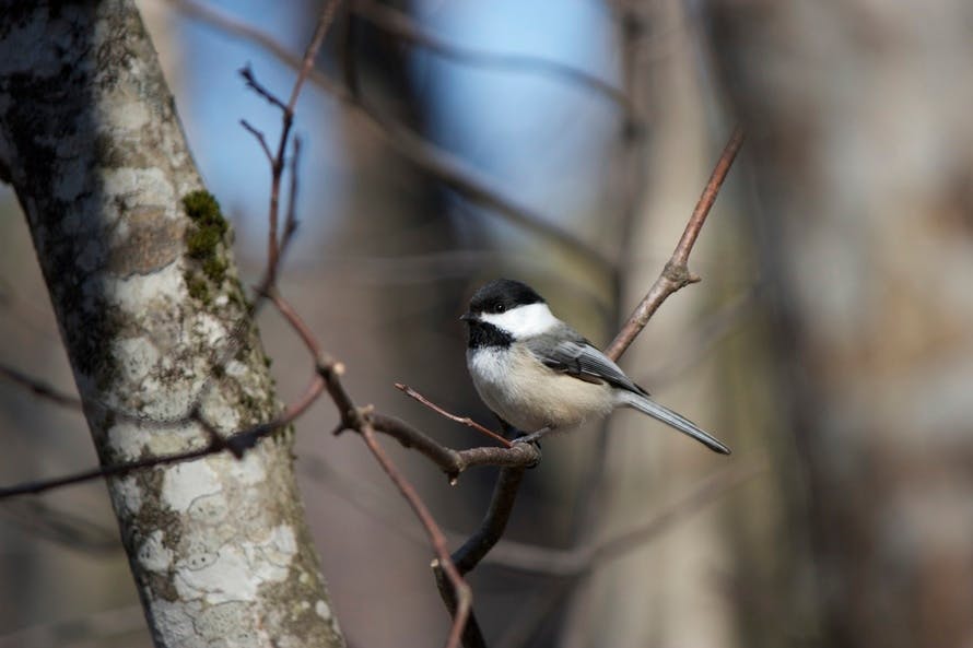


Pexels
Gratisography

Morguefiles

Unsplash
I like the layout if your post, but you could add some improvements such as bolding titles or making some text larger.
ReplyDeleteI really liked the way it was set up, but it all feels fairly disjointed. But, I still enjoy how all of the info is there and you don't have to search around for pros and cons. Good work!
ReplyDeleteThere are some weird formatting issues (no capitalization, that sorta thing) and one of your pictures doesn't have a site next to it, but it's all easy to fix.
ReplyDeletethe formatting is kind of weird but other wise it looks really good. I like your background a lot too.
ReplyDeleteWhile a good way to quickly explain the point of the project, it seems more like a Q and A instead of a blog post. Also one of the pictures don't have a name next to it.
ReplyDelete